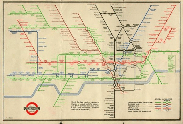
The story of the London Tube Map
Dear all,
It was good to be able to welcome our students back to school this week after the Easter break. Our ‘Thought for the Week’ referenced World Art Day, first established in 2012 to celebrate the birth date of Leonardo Da Vinci and endorsed in 2019 by the 40th session of UNESCO, which recognised that Art ‘nurtures creativity, innovation and cultural diversity for all peoples across the globe, and plays an important role in sharing knowledge and encouraging curiosity and dialogue.’
One of the most iconic pieces of ‘functional’ art in the world is the London Tube Map. In the late 1800s and early 1900s, the companies that owned the railway lines across London had a problem: the further the railways extended away from London, the more congested the centre of their maps became, which made them very difficult to read.
In 1931 Harry Beck, a draughtsman who worked for the Underground, designed a radically different approach. Instead of drawing the map. The dense central section was enlarged in relation to the outlying areas, allowing both to be shown more clearly, and the map dispensed with conventional geographical accuracy, aiming to enable passengers to understand the network more quickly and simply. It used only horizontal, vertical, and 45º lines, and the Underground lines were represented by a set of standard colours. The Underground’s publicity department initially rejected Beck’s idea for being too revolutionary.
In 1933, the various train companies were unified into London Transport, and Beck’s proposal was approved with a trial pocket map, which proved an instant hit with passengers. For the next 28 years, Beck added further features to his map, based on feedback from passengers, further extensions were added including the Jubilee and Victoria lines. More recently, the DLR, Emirates Air Line and TfL rail lines have been added, all of which is a testament to the flexibility (and durability) of Harry Beck’s design.
The London Underground map is internationally recognised as an example of graphic and information design excellence. Many other urban railways – New York, Sydney, and Saint Petersburg – based their maps on Beck’s concept.
Many artists have also been inspired by the map and have remade it with different materials, reflecting its worldwide fame as a key part of the brand identity of the Underground, and by extension, London itself.
The Tube Map has, of course, been used in many different ways over the years, as celebrated here.
Have a great weekend
Best wishes
Michael Bond


